Dry Goods丨6 Tips, Do A Good Job Of Color Correction In The Gravure Process
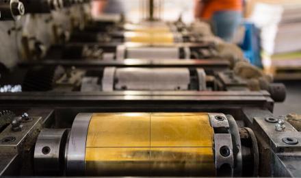
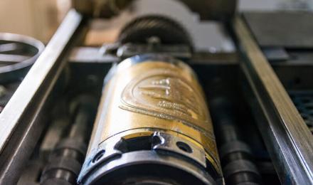
Gravure printing, referred to as gravure, is one of the four major printing methods. Its printed products have the advantages of a thick ink layer, bright color, high saturation and stable print quality. In the gravure printing process, it is difficult to accurately reproduce colors.
First of all, color is a very subjective thing, and each customer’s perception and requirements are different. Secondly, due to the mismatch between the original color, screen color, digital proofing color and gravure ink proofing color, coupled with the grayscale and color bias contained in the hue of gravure three primary color inks, the color desired by customers cannot be fully configured.
Therefore, it is very important to master the color correction theory, method and essentials of such products.
Here are 6 color correction tips:
-
Emphasize The Saturation Of Colors
To deliver the on color, products should master the following methods and essentials.
(1) The depth of the basic primary colors should be sufficient. The field proofing and printing products as well as the grinding layer should be thick.
( 2) When using electronic engraving cylinder, the M color swatch should be 37° or <>°, so that it is easy to ink.
(3) The mesh cavity is slightly deepened during carving. So that the ink content is increased. The concentration of red is highlighted to meet customer requirements;
(4) For large areas of large areas with high requirements of the field big red, the secondary engraving method can be used to highlight the special effect of the large red color and bright color.
-
Handle The Colors Of The Two Dot Jump Zones
Process the color of <>% of the dot jump area
According to the law of engraving gravure roller dots and OPP film proofing and printing dot increase, 80% of the area is a jump area where the dots turn, more than 80% of the dots increase in a straight line, and the color levels are easy to merge. The increase in dots below 80% is relatively moderate, and the level can generally be printed.
Therefore, to remember the essentials of color processing. The deepest red basic the primary color and 80% ~ 85% of the deep middle tone of orange, flesh, brown and other complex colors open the distance. It is best to open 20% ~ 25%. On the other hand, it can make dark orange, flesh, brown and other compound colors without red and achieve the best of both worlds.
Handle the color of the <>% dot jump area
According to the law, the engraving cylinder is easy to lose small dots. The OPP film proofing and printing of small dots are poorly transferred due to the thinning of high-gloss ink. The small dots below 5% cannot be printed, resulting in insufficient ink volume in high-gloss and light-tone tones. With that, it is easy to be parallel with the extremely high-gloss networking part.
Therefore, it is necessary to consciously deepen the adjustment of the basic color of the highlight tone. So that it is separated from the extremely high light for the highlight color is full.
-
Emphasize The Brightness Of Colors
Packaging products emphasize the visual effect of color and require bright colors. Therefore, bright colors in bright tones and bright middle tones should be composed of primary colors and intermediate colors as much as possible, and complementary colors should not be used or moderately applied to make the colors bright and bright.
-
Handle The Continuous Transition Tones Of The Physical Color
When making color corrections and adjustments, we should pay attention to the relationship between light and dark changes in hue. Then, pay attention to maintaining a continuous transition tone between dark and medium tones, highlight colors and bright tones.
The grain is rough, mainly manifested in the tone of the 80% dot area jumping deeper, disconnected from the middle tone. The tone of the 5% dot area jumping to the shallow place, disconnects from the tone of the bright tone area, and the hard mouth with rough grain appears.
Therefore, when correcting and adjusting the colors of oranges, apples, tomatoes, greens and other colors, it is necessary to connect the tones naturally, especially the main color version, such as the M version of warm colors, and the C version of cold colors, to maintain continuous transition tones.
-
Handle The Color Of The Foreign Data File
At present, more than 60% of the original manuscripts of gravure printing plates are designed by advertising companies as foreign electronic documents, because their image scanning color separation adopts the long-tone black version of the GCR process color separation mode, and the gravure printing process of packaging products adopts the short-tone black plate process based on three primary colors. Therefore, the GCR color data of the foreign data file should be adjusted to the color data dominated by three primary colors. Three adjustment methods should be mastered for such documents:
(1) Reduce the amount of ink in the dark tone of the image, and make it distance from the black words outside the image. use Photoshop’s Selective Color selection tool, select the black color, and reduce the ink amount of the black version from 100%~70% to about 60%. The C version was deepened from about 90% to 93%~55%, and the M and Y versions were deepened from about 80% to 83%~<>%.
(4) Shorten the tone of the black version, and use the Curve tool to shorten the starting point of the highlight end to about <>% of the C version. Use the Curve tool to moderately deepen complementary colors in colors.
(3) Darkening the complementary colors replaced by black, resulting in insufficient saturation of the dark tone of the image.
-
Precautions For Color Adjustment
(1) Color adjustment should be carried out after grading and correcting color cast. This is because the grey balance of the hierarchy curve and the correction of color cast changes will affect the color change. This is often not noticed.
(2) Color correction is interrelated. When using color calibration tools such as Photoshop, the amount of color correction should not be too large. Otherwise, it will cause a series of problems.
Such as: it will affect the adjacent color, cause confusion, and the result is often not correctly analyzed and judged the problem.
(3) Photoshop color correction tools Hue/Saturation and Color Balance. Selective Colors are mainly used for the adjustment of primary color (primary color), intercolor (secondary color) color part. Do not use it to correct the double color (tertiary color).
With the upgrading of consumer demand, more accurate color expressions are coming up in gravure printing. This is mainly in the printing and packaging enterprises. How to accurately grasp color is a topic that every printing and packaging field should be concerned about.